plus
One document. Everything we've decided about the dot+ identity — the logo system, the colors that build it, how it moves, and the design tokens the product is made of.
The logo system
Three parts, one identity. Each mark has a specific job: the icon scales down, the wordmark scales up, and “dot+” as a literal text mark covers places where the wordmark’s leading-dot grammar (.plus) needs more context. They never appear together at the same scale — pick the one that fits the context.
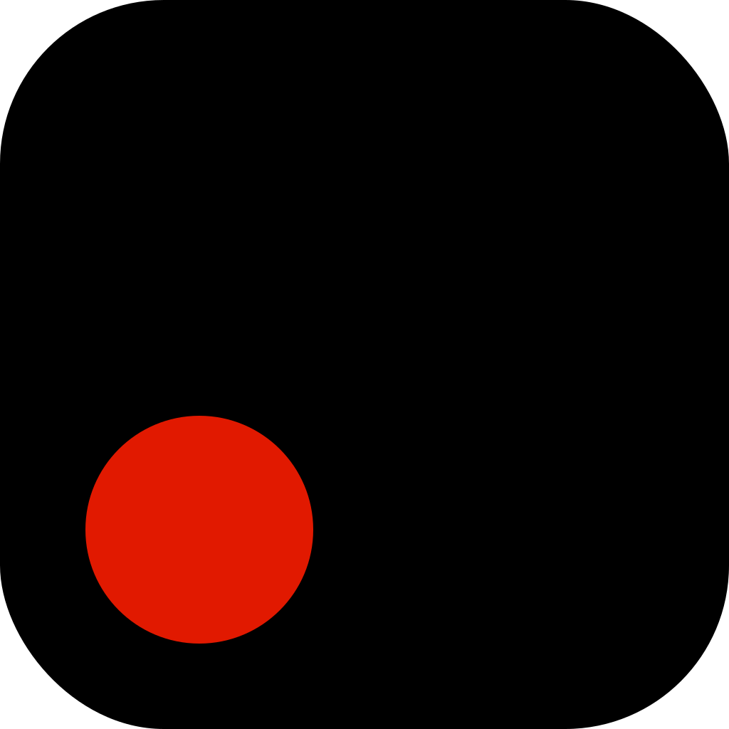
A solid disc placed in the lower-left of a rounded square — sitting on the baseline like a literal period. The "+" is implied by the icon's role in the system.
Inter Black, tight tracking, with the leading dot as a separate disc — not a typed period. The dot ties back to the icon. Pronounced "dot plus".
The brand name spelled out. Inter Black, tight tracking. No leading disc — the word “dot” is already on the page, so the disc would be redundant (that’s what makes .plus distinct from this).
Exact colors used by the logo
The logo is monochrome by rule. Only four hex values are ever permitted in the mark itself; accent colors appear only as the disc in mono+1 hero variants on a Paper canvas.
The logo uses pure values; the UI does not. On OLED, the icon disc at mono.900 reads as washed-out grey next to apps using pure black. We now reserve two dedicated mark tokens at #000000 and #FFFFFF for the logo only. UI surfaces stay at mono.900 / mono.50 for eye comfort across large fields.
disc on Paper icon · OLED punch
icon canvas · wordmark · text mark
never used in the logo
never used in the logo
Rule of three: the logo is always built from exactly two values at a time — Mark Ink (#000000) + Mark Paper (#FFFFFF). The third color (an accent) is only permitted as the disc in mono+1 hero variants on a Paper canvas, and only in marketing or splash contexts — never in product chrome.
Motion · the morph
The icon becomes the wordmark. The canvas fades out, the disc shrinks and slides up-right onto the baseline, and "plus" fades in beside it. Use this once — splash to home. Never as a loop in product chrome.
animation-fill-mode: forwardsSizing & clearspace
A real logo survives the screenshot of a home screen. The icon's geometry has been tuned so the disc remains visible down to 16pt.
Clearspace: reserve a margin equal to the disc diameter on all four sides of any mark. Never crop, never letterbox, never set the icon against a busy photo without padding.
Surfaces
How the icon adapts across the dot+ palette.
Recording state
A controlled mono+1 variant. The disc switches to mark.recording (#E11900) and pulses on a 1.6s ease. Use only when audio capture is active — nav indicator, splash during a meeting, the Apple Watch complication, the record button itself. The mark is the indicator.
#FFFFFF · #E11900The recording variant inherits all other rules — same canvas radius, same disc position, same clearspace. Only the disc fill changes. Do NOT use this red disc as a generic accent or in marketing; reserve it strictly for the live-capture moment so the signal stays meaningful.
AI state · the .plus lockup
A second mono+1 variant. The disc switches to accent.info (#276EF1) — the blue we already use for AI labels, links and Gemini badges. Use it whenever the user is talking to dot+ rather than recording with it: the AI chat sheet, assistant suggestions, the Gemini model picker, ‘summarize’ overlays.
When the icon expands into an AI surface, the disc slides into the leading-dot position of the .plus wordmark. That continuity is the point: the same disc that was the icon becomes the leading dot of the wordmark, recolored to blue. We don’t add a separate “dot+ AI” label — the lockup is the label.
#FFFFFF · #276EF1
Don’t pair the blue disc with the literal text mark dot+ (Part 3) — that reads as the brand name colored blue, not as a state. The AI variant is always either the icon (Part 1) or the .plus wordmark (Part 2), never the text mark.
Do / don't
The mark is geometric and minimal. Keep it that way.
Disc in lower-left, sitting on the baseline. Always Ink on Paper or Paper on Ink.
Never gradient the canvas. The logo is two flat colors. No bevels, glows, or duotone effects.
Never rotate, skew, or distort the canvas. The disc must sit on a horizontal baseline.
No accent disc in product chrome. Mono+1 is for marketing and splash only.
Don't change the canvas radius. The 22% corner radius is part of the mark's signature.
Never center the disc. It must sit on the baseline in the lower-left quadrant.
Full palette
The primitive scale that builds every semantic token. Components reference semantic — never these directly.
Typography
Inter for everything human. JetBrains Mono for everything machine — timestamps, model names, code, keys.
Spacing & radius
A 4px base scale and four corner radii. Nothing in the product references a raw px value — only these tokens.
Spacing
Radius
Motion
Components
Each component references semantic tokens only. Live previews here; full contracts in handoff/tokens.json.
Asset library
Every file that constitutes the v1.1 system. handoff/tokens.json is the source of truth for values.